.2t7gpa290wu2l.webp&w=3840&q=75)
- Client
- NOEME
A jewellery brand
for every version
of her. - Year
- 2026
- Deliverables
- Brand Strategy
Visual Identity
Packaging Design
Art Direction
AI Visual Production - Role
- Creative Direction
Brand Identity
Packaging Design
AI Production
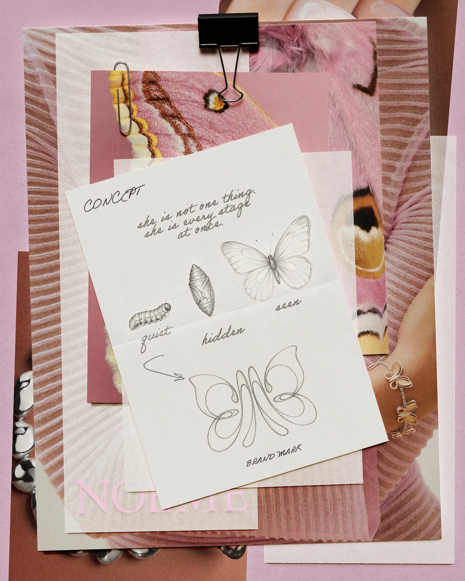
She is not one thing.
She is every stage
at once.
NOEME began with a simple observation: a woman is never just one thing. She is city and island, vintage and now - composed and impulsive, soft and exacting - often all within the same day. The identity was created to make room for that multiplicity rather than reduce her to one image.
The butterfly became the central metaphor. Its form holds the caterpillar, cocoon and wings in one idea: not a linear before-and-after, but every version of the self held together. That tension between transformation and continuity shaped the mark, the packaging, and every image in the world of NOEME.
The bag
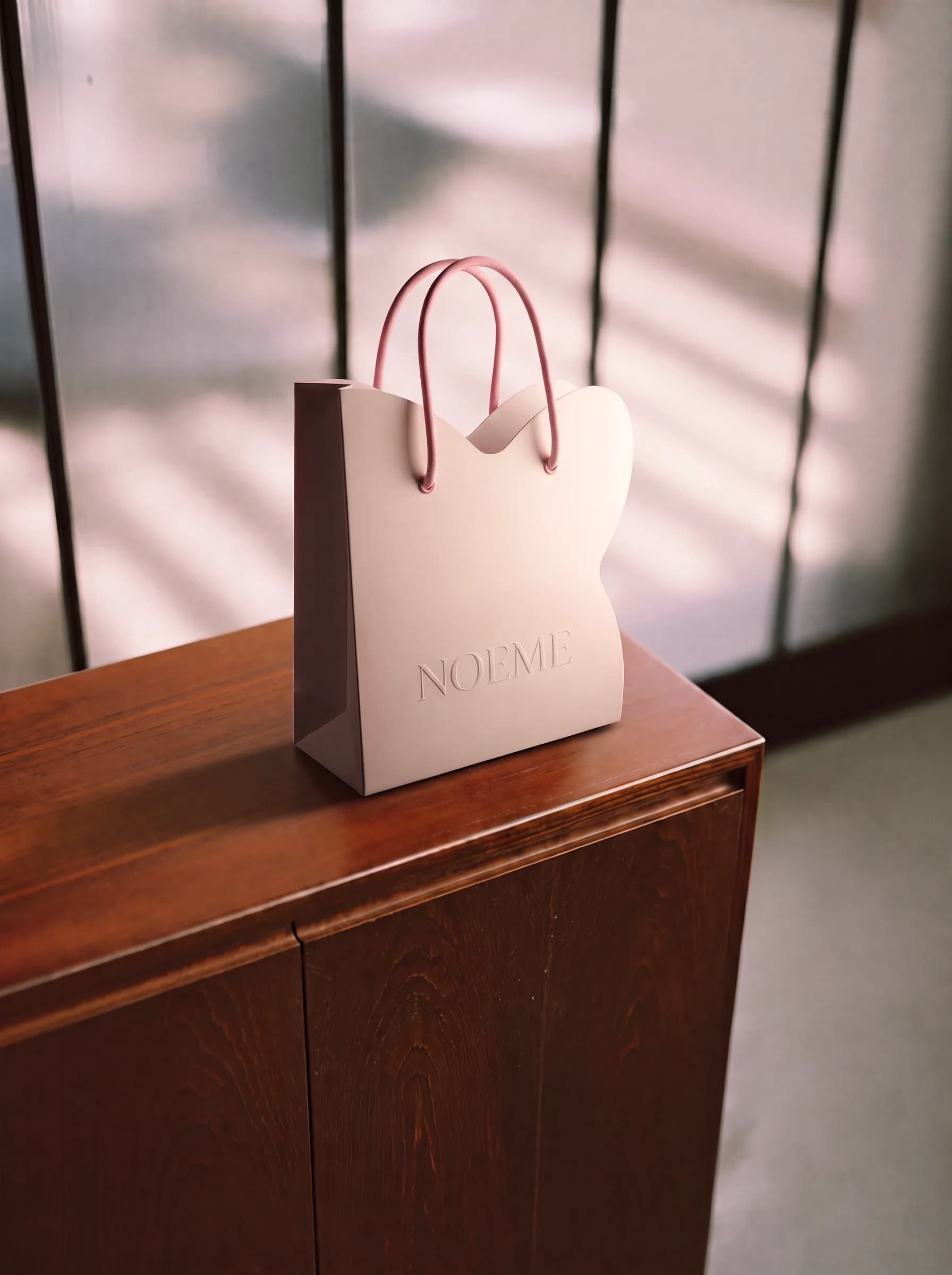
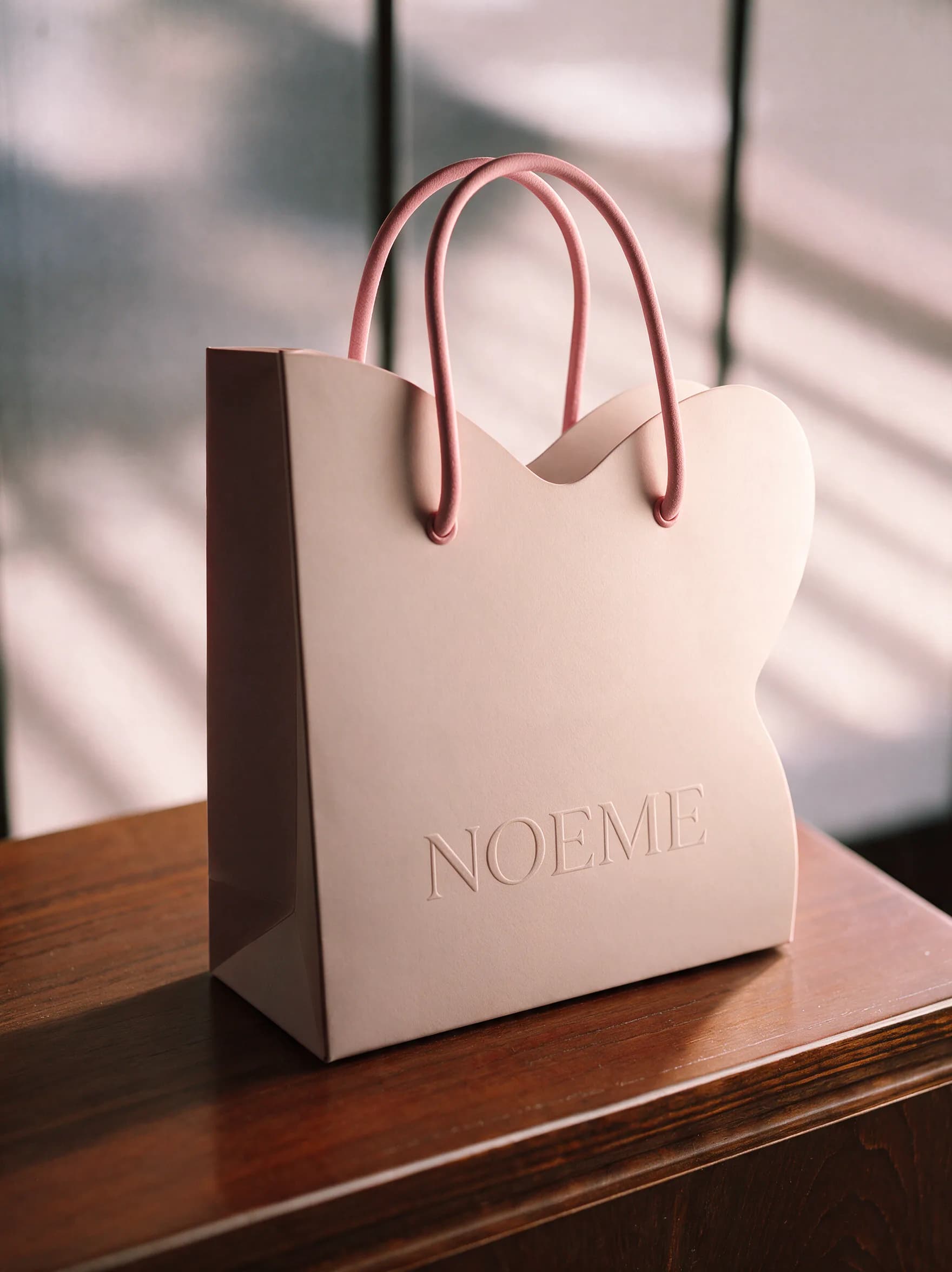
The shopping bag takes its silhouette from the brand mark. Its top edge rises into a soft, asymmetric curve - a butterfly wing - while the body remains structured enough to stand on its own. A matte off-white paper stock, pink cord handles and a restrained embossed wordmark make the object feel tactile and considered.
The boxes
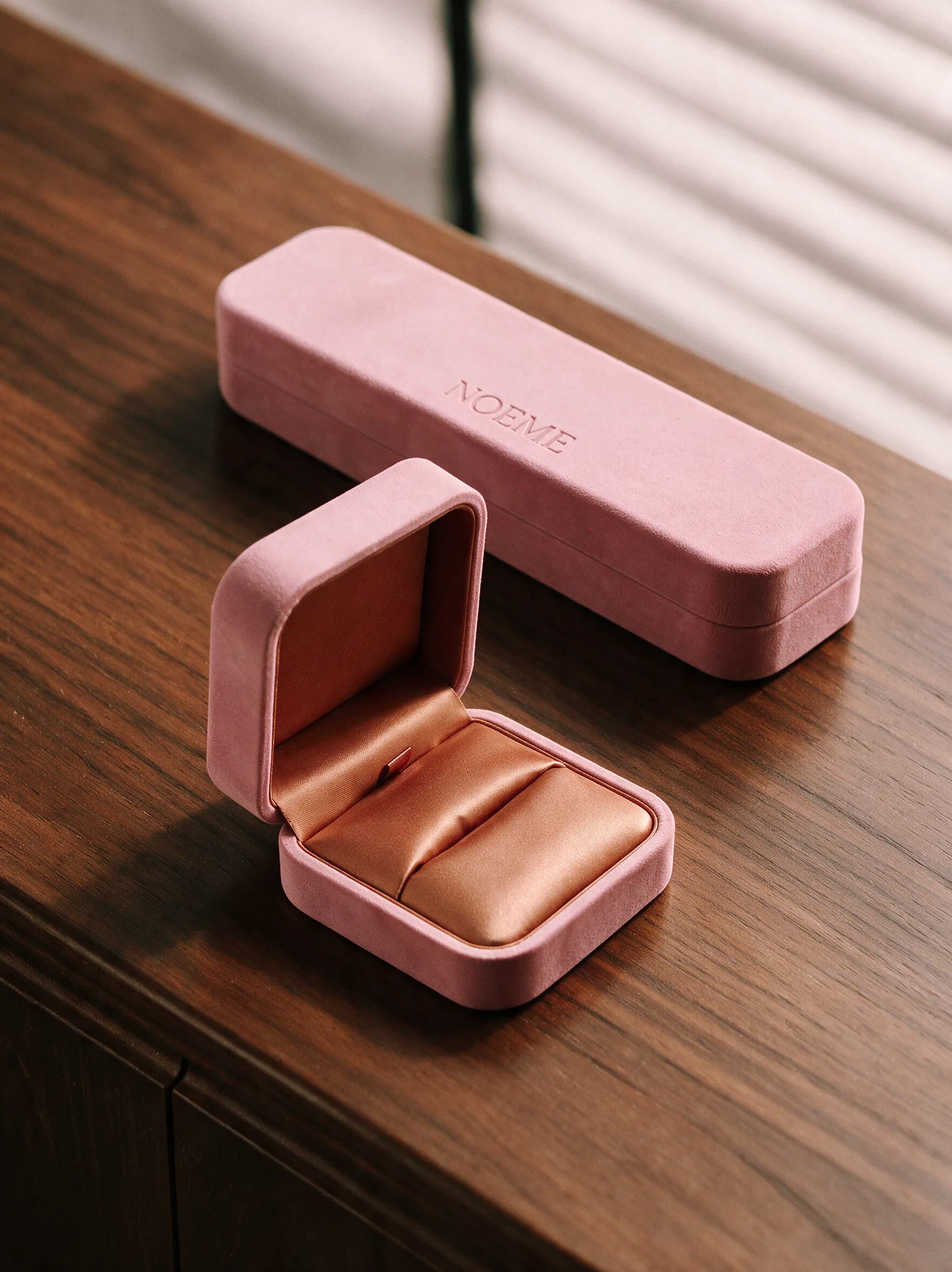
Ring and necklace boxes repeat the same visual logic at a more intimate scale: a muted pink, velvet-like exterior gives way to a terracotta silk interior. The palette carries a deliberate contrast - composed softness on the surface, warmth underneath. Two box proportions accommodate rings and earrings, or necklaces and chains, while keeping the whole system one family.
Grounded femininity,
held in light.
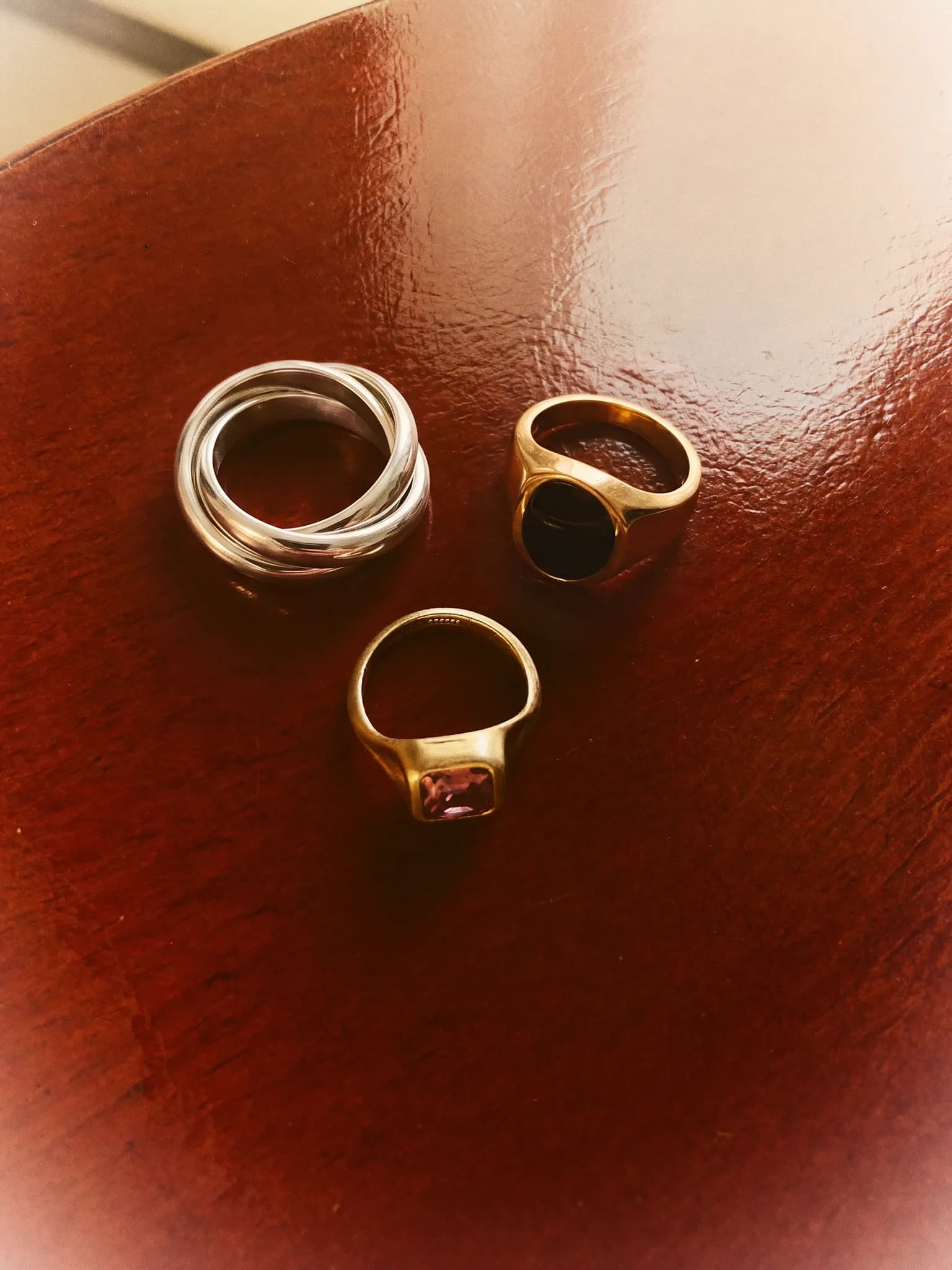
The visual language is grounded in terracotta, deep brown and black, with notes of pink. Warm, directional light creates a cinematic mood: intimate rather than polished, tactile rather than decorative.
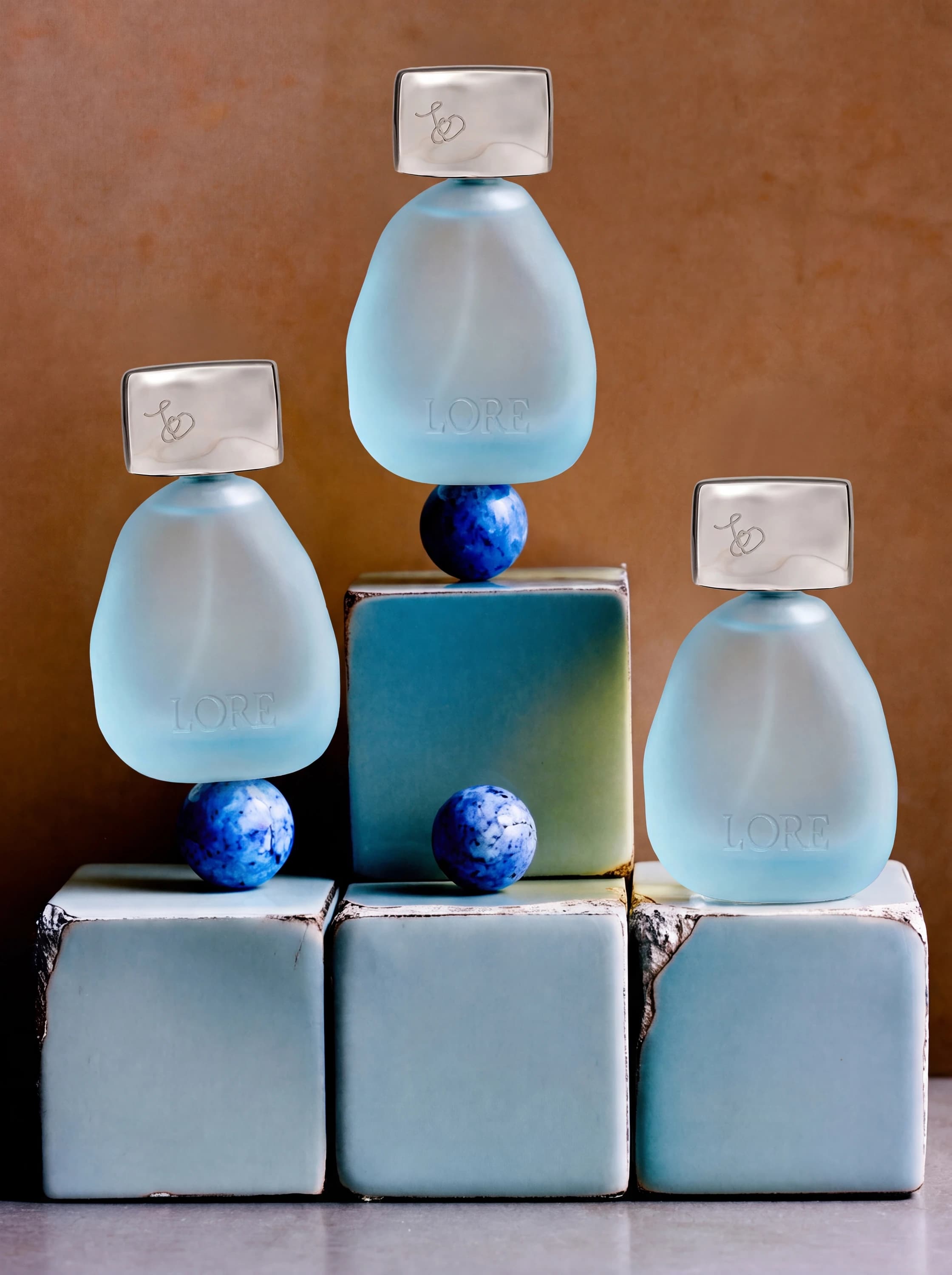
Packaging and campaign visuals in this case study were generated with AI around NOEME's original product designs, materials and colour system. The result was a complete art-directed world - from close product studies to social-first storytelling - built with the same precision as a traditional campaign.
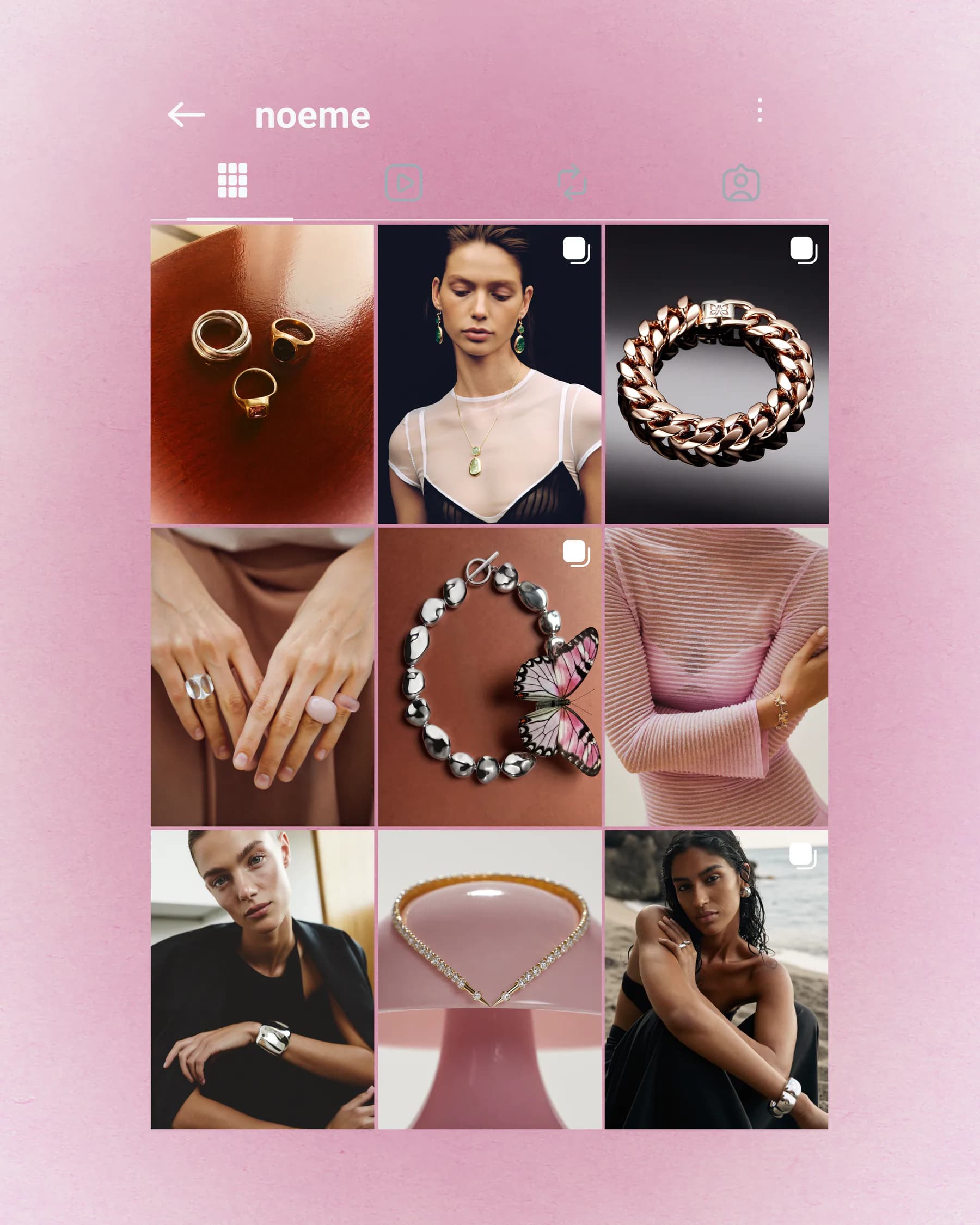
One identity, many worlds.
Different visual registers give the brand room to move - each one revealing a distinct facet without losing the warmth and material language of NOEME.
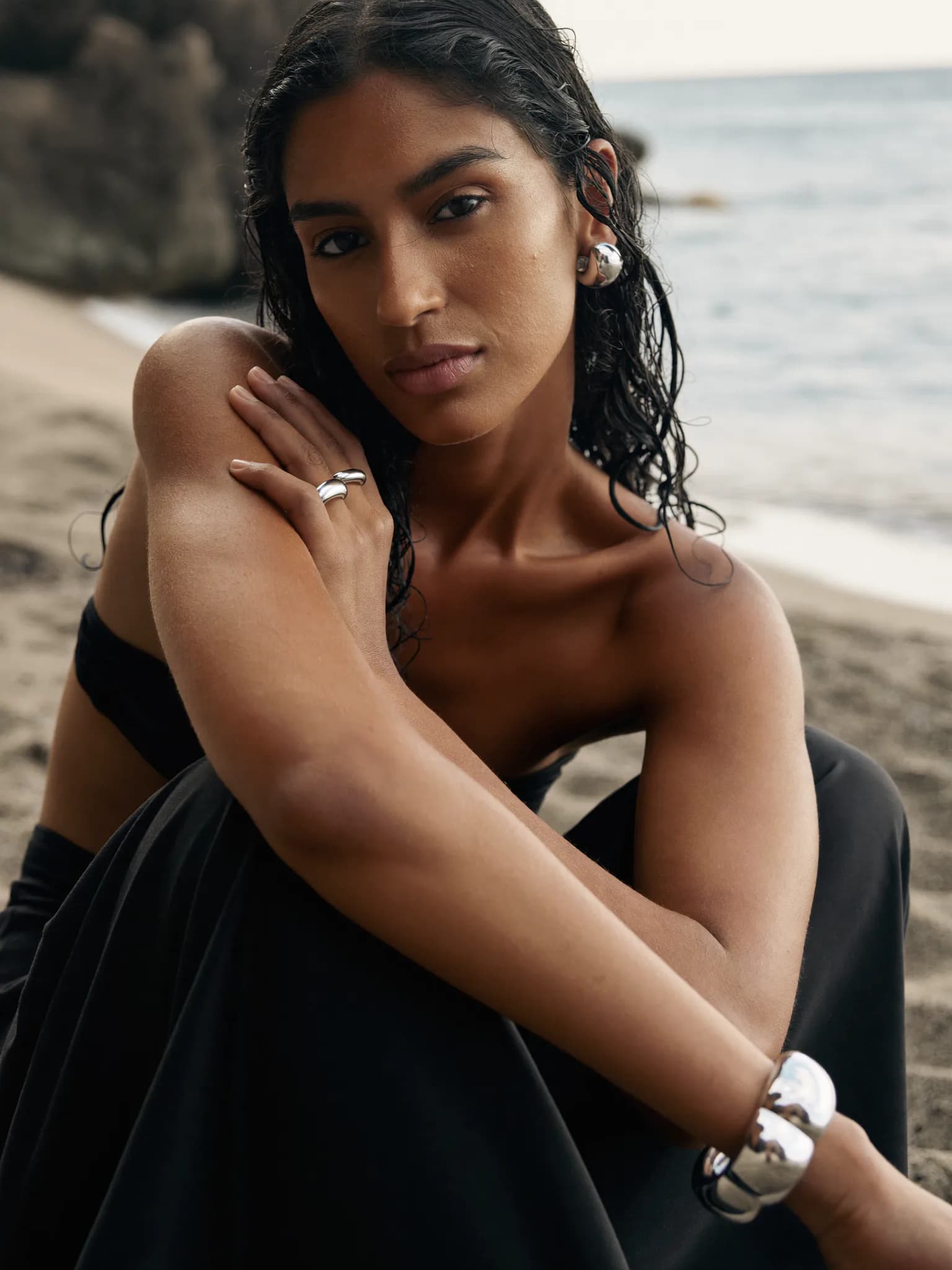
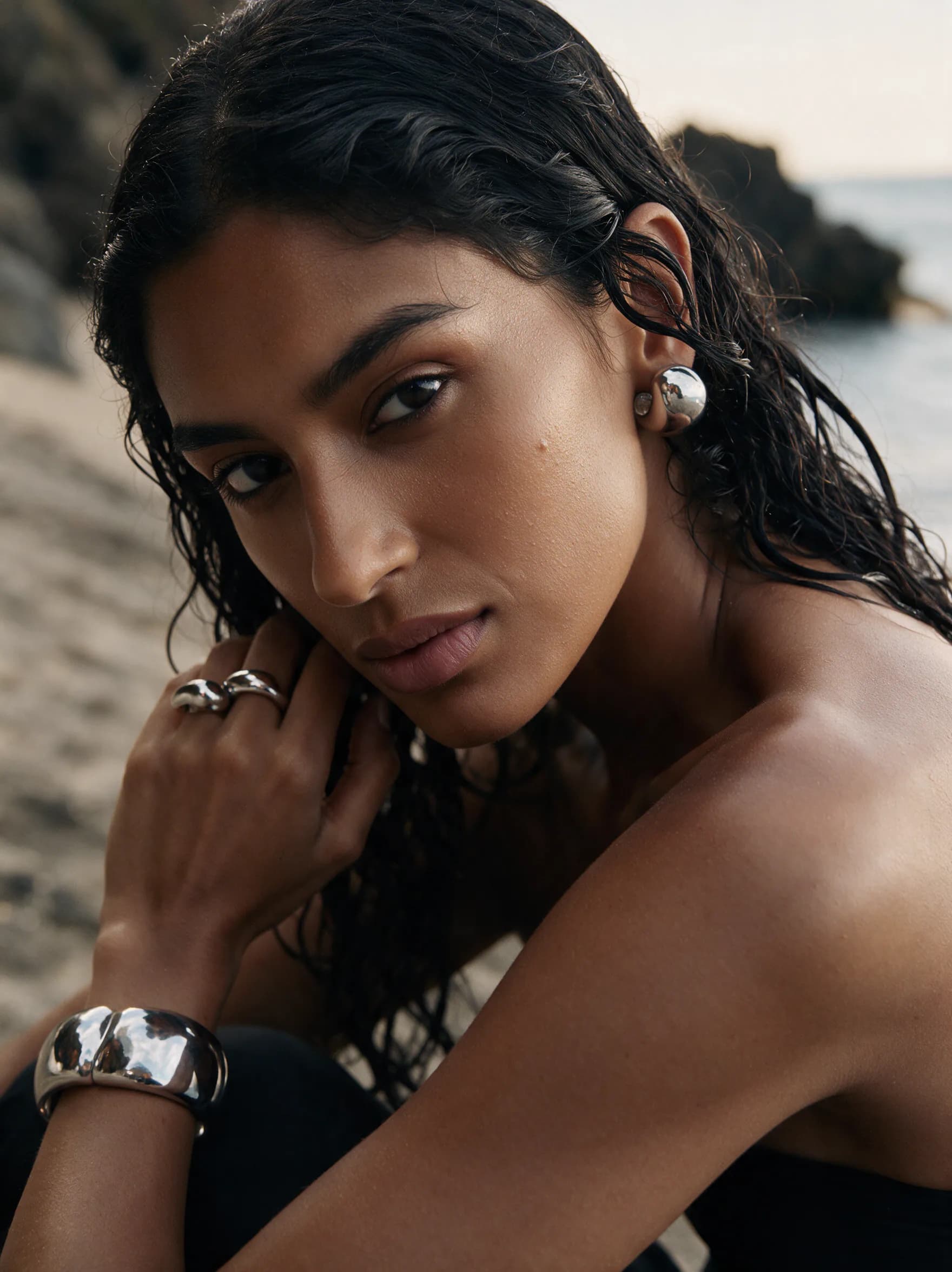
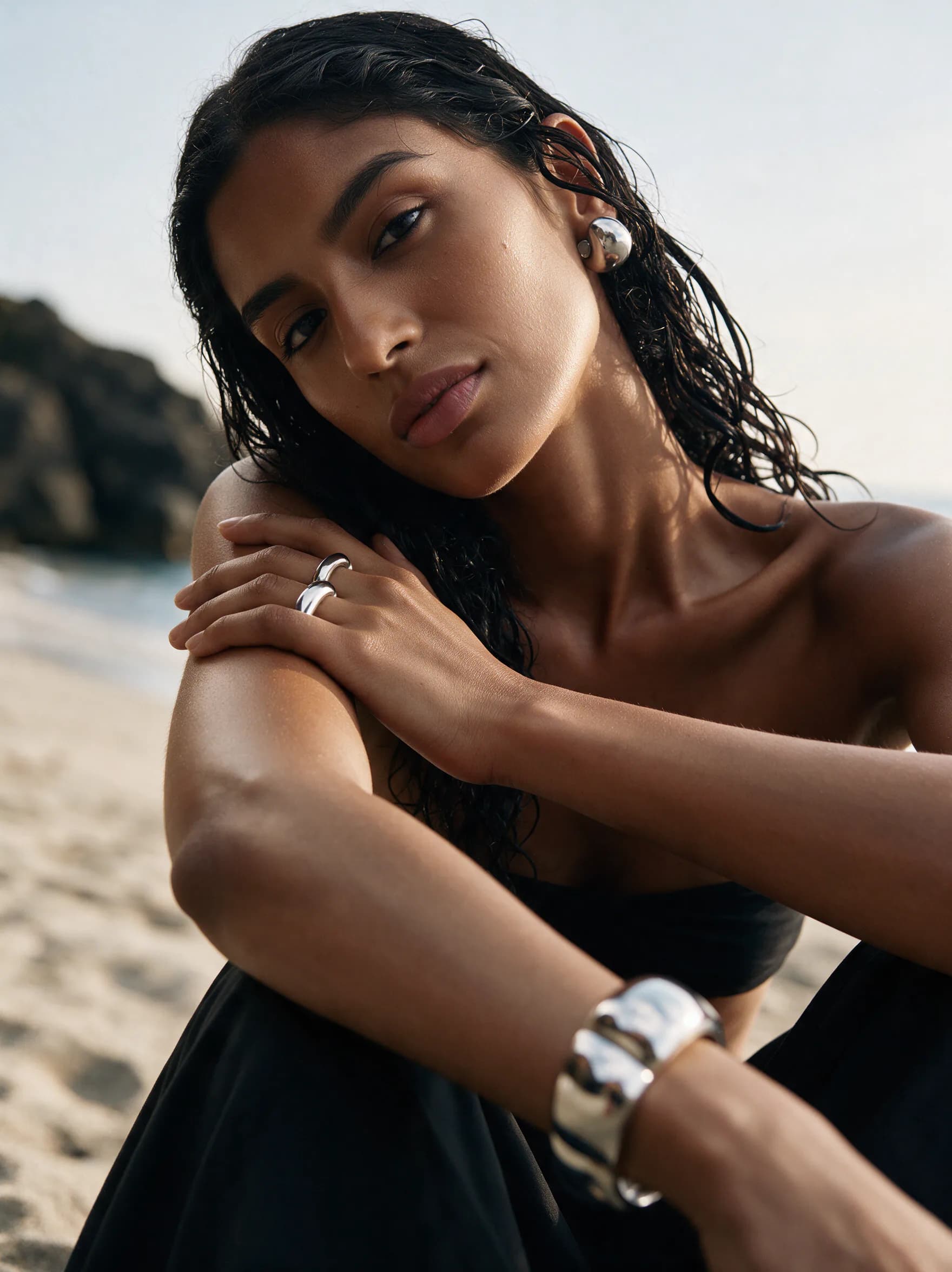
Island
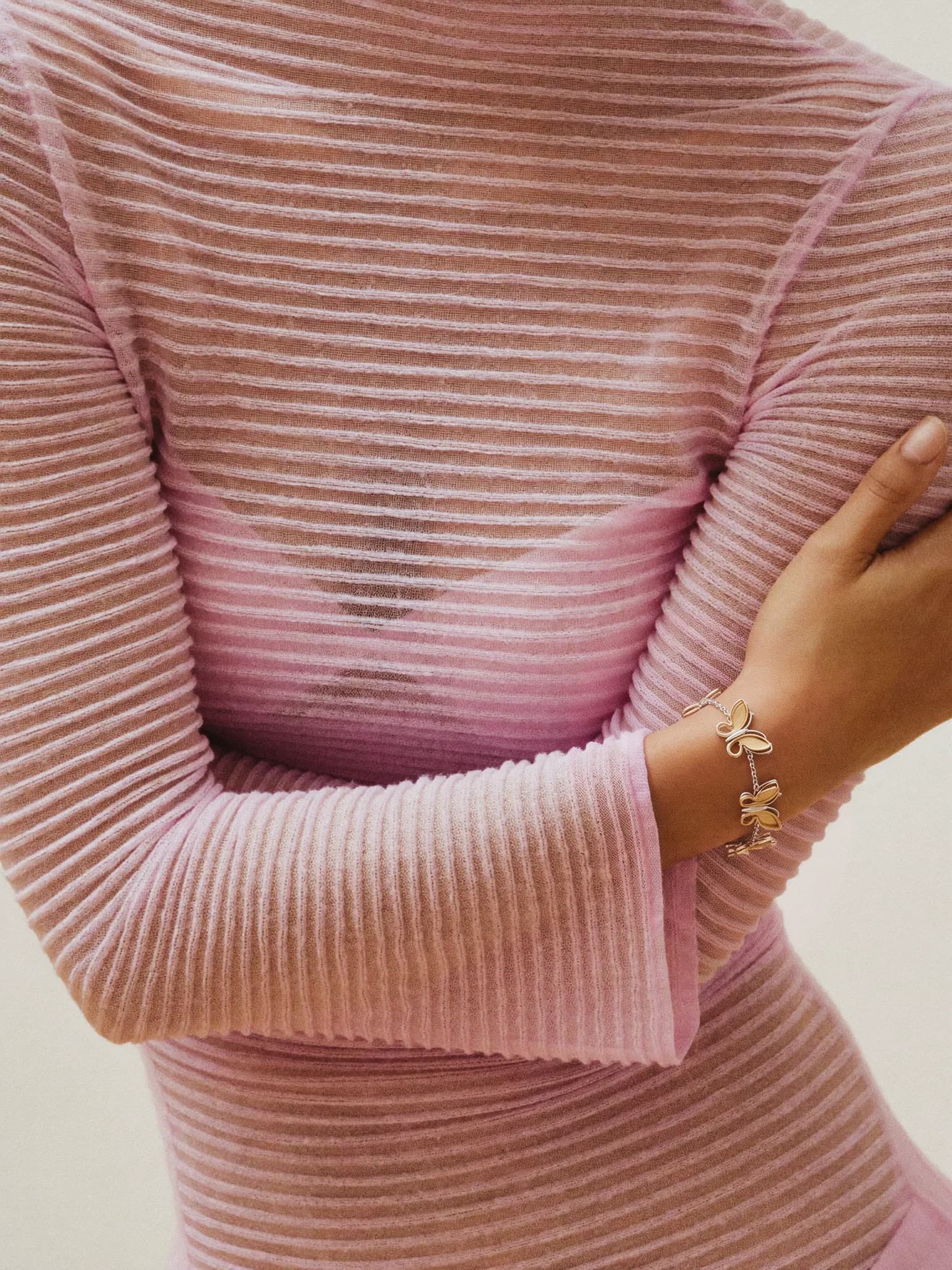
Salt, wet hair and silver worn close to skin. A study in lightness, escape and the memory of freedom.
Vintage
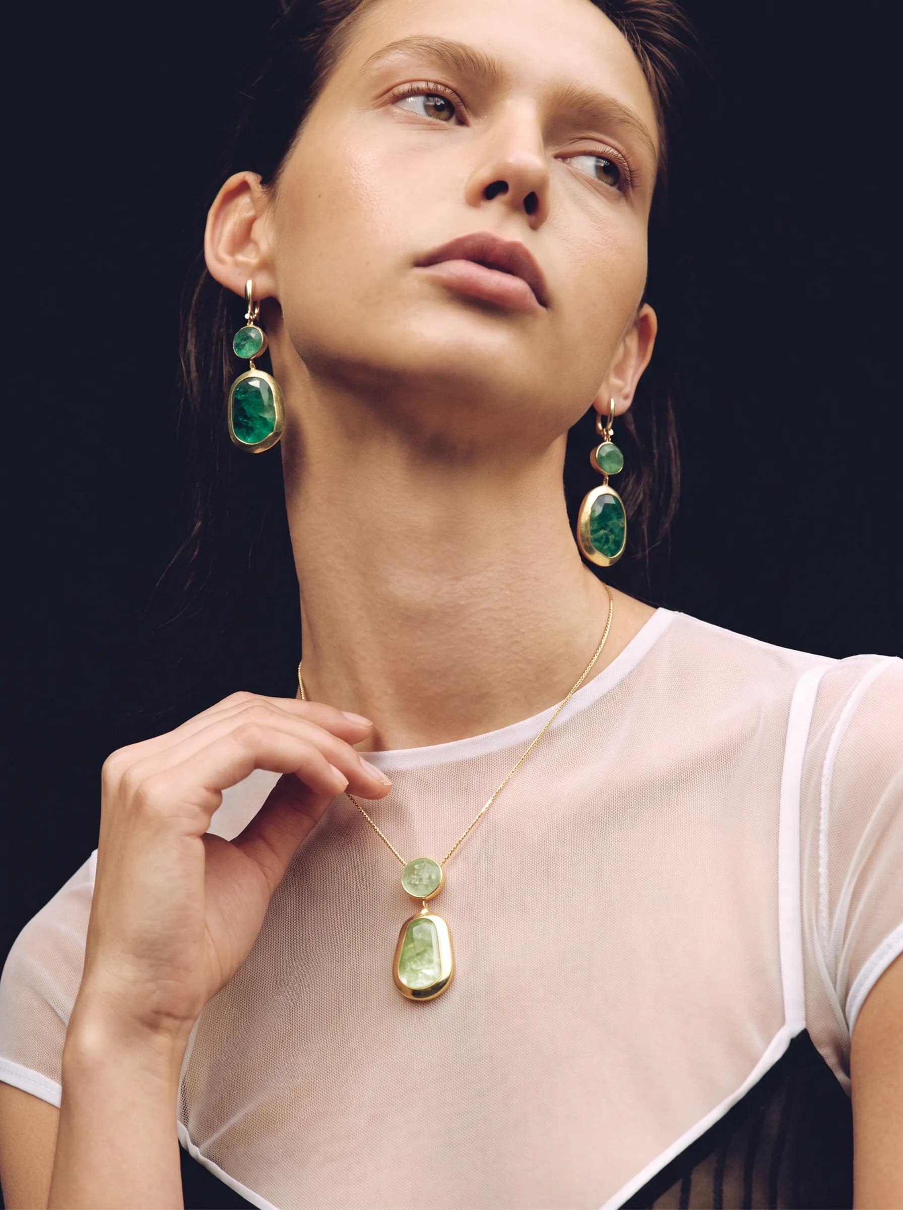
Deep-set emerald stone and warm gold, styled to read like something inherited rather than newly bought.

Product studies
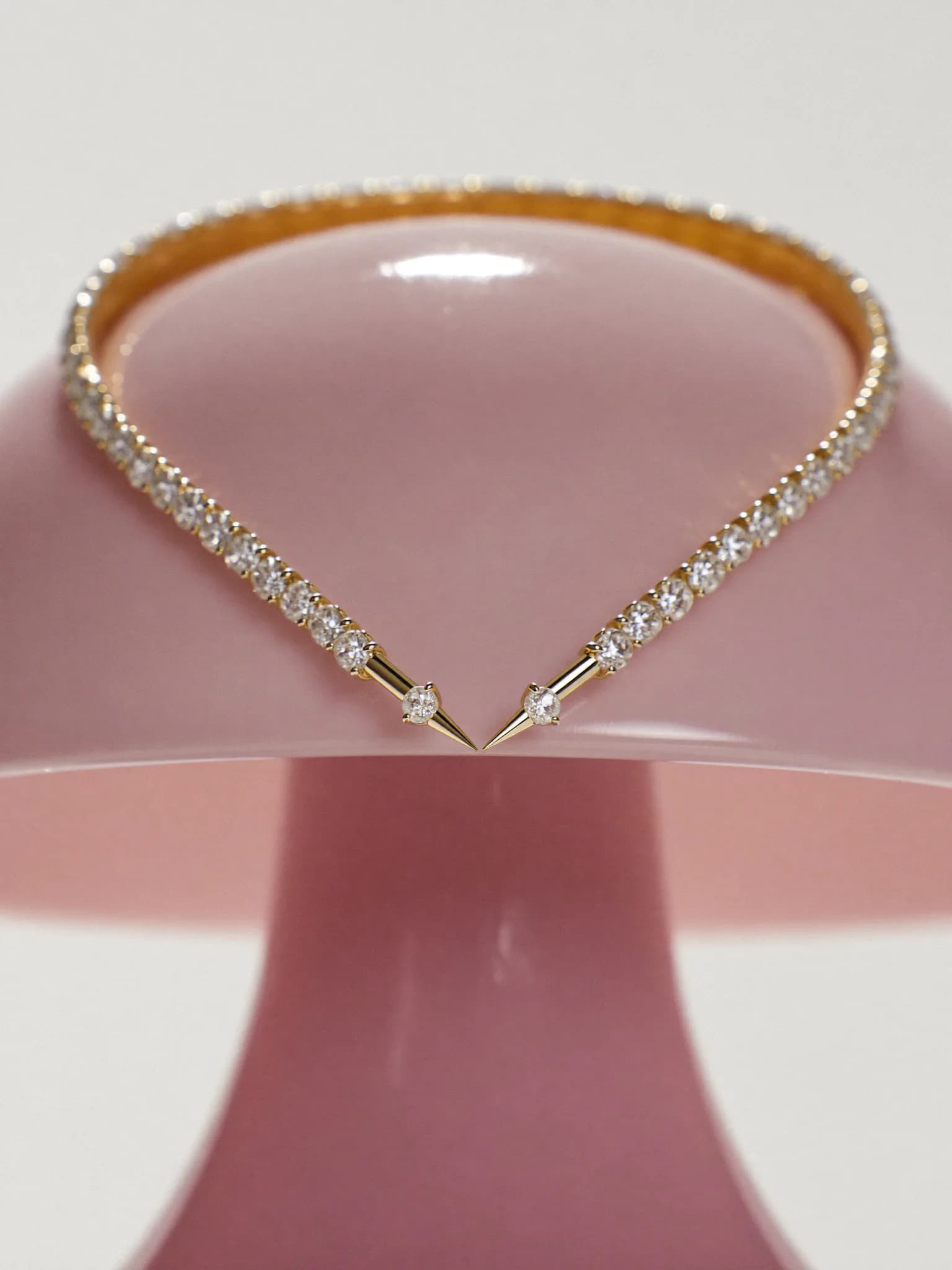
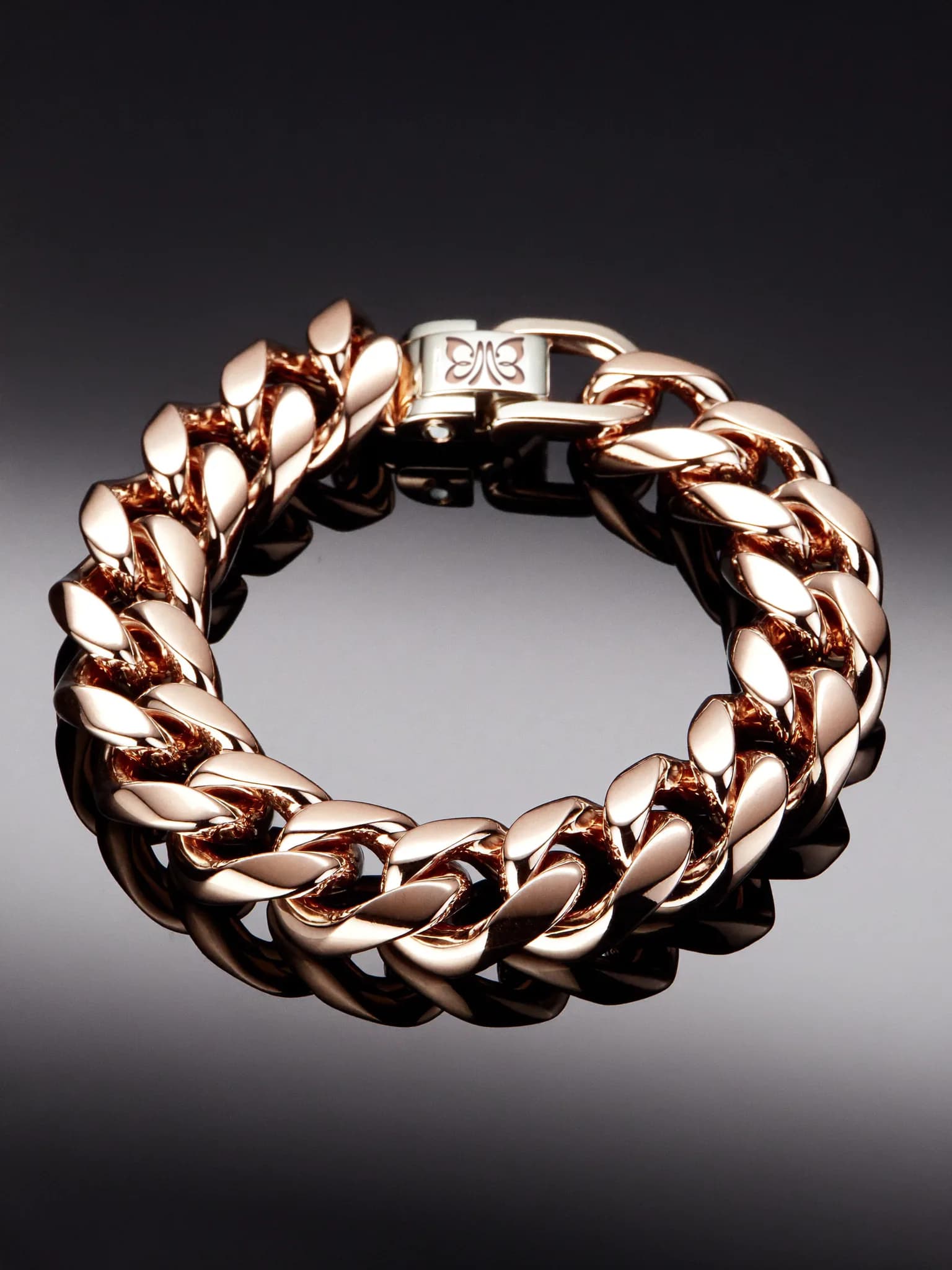
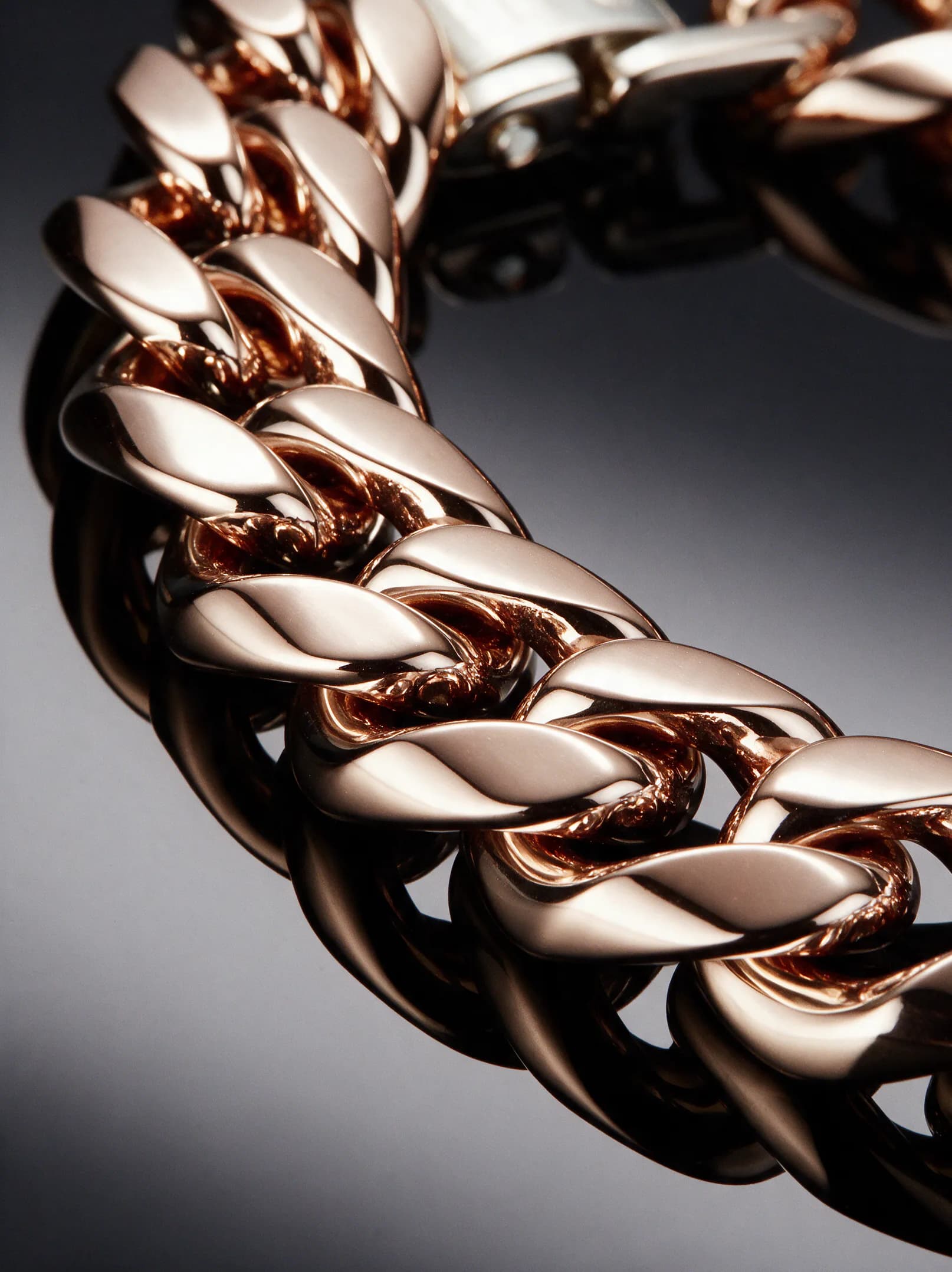
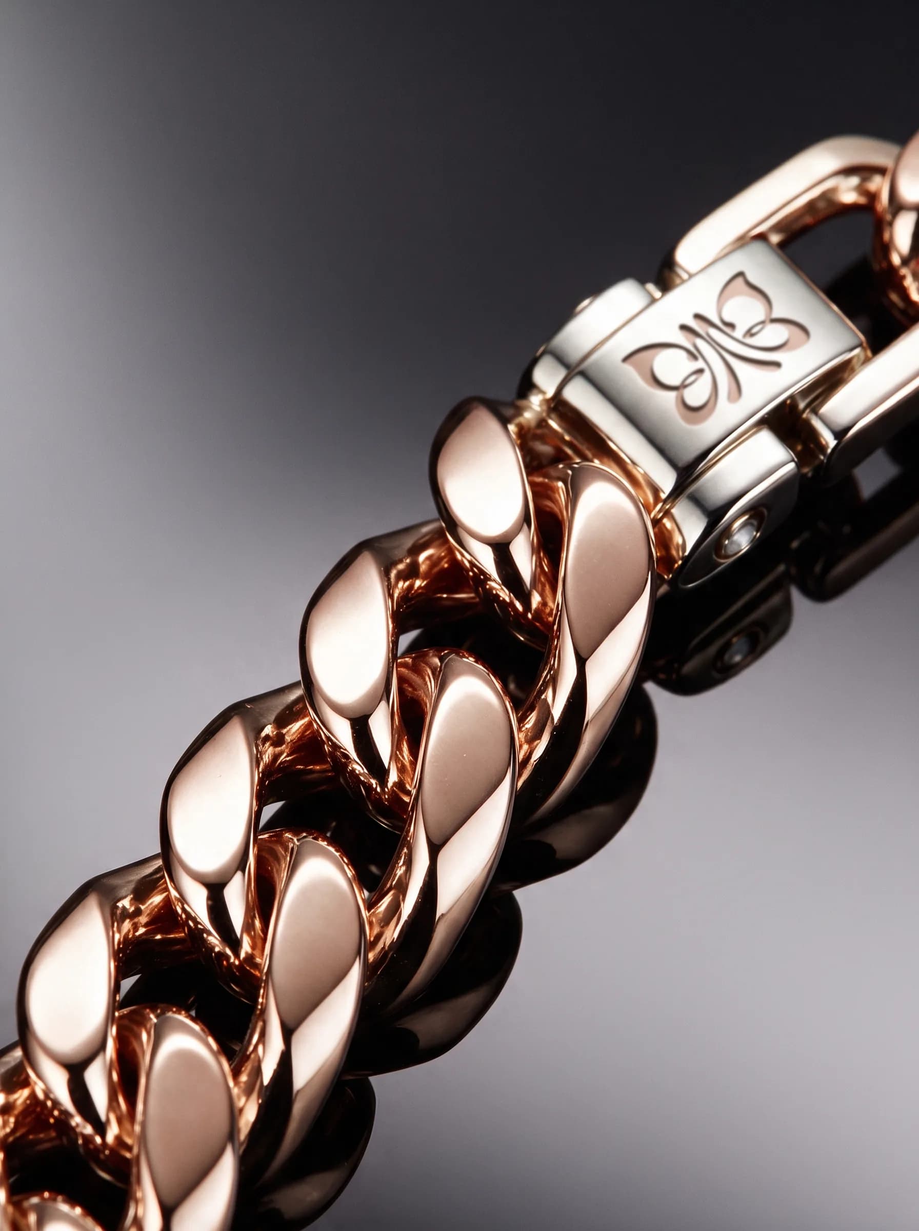
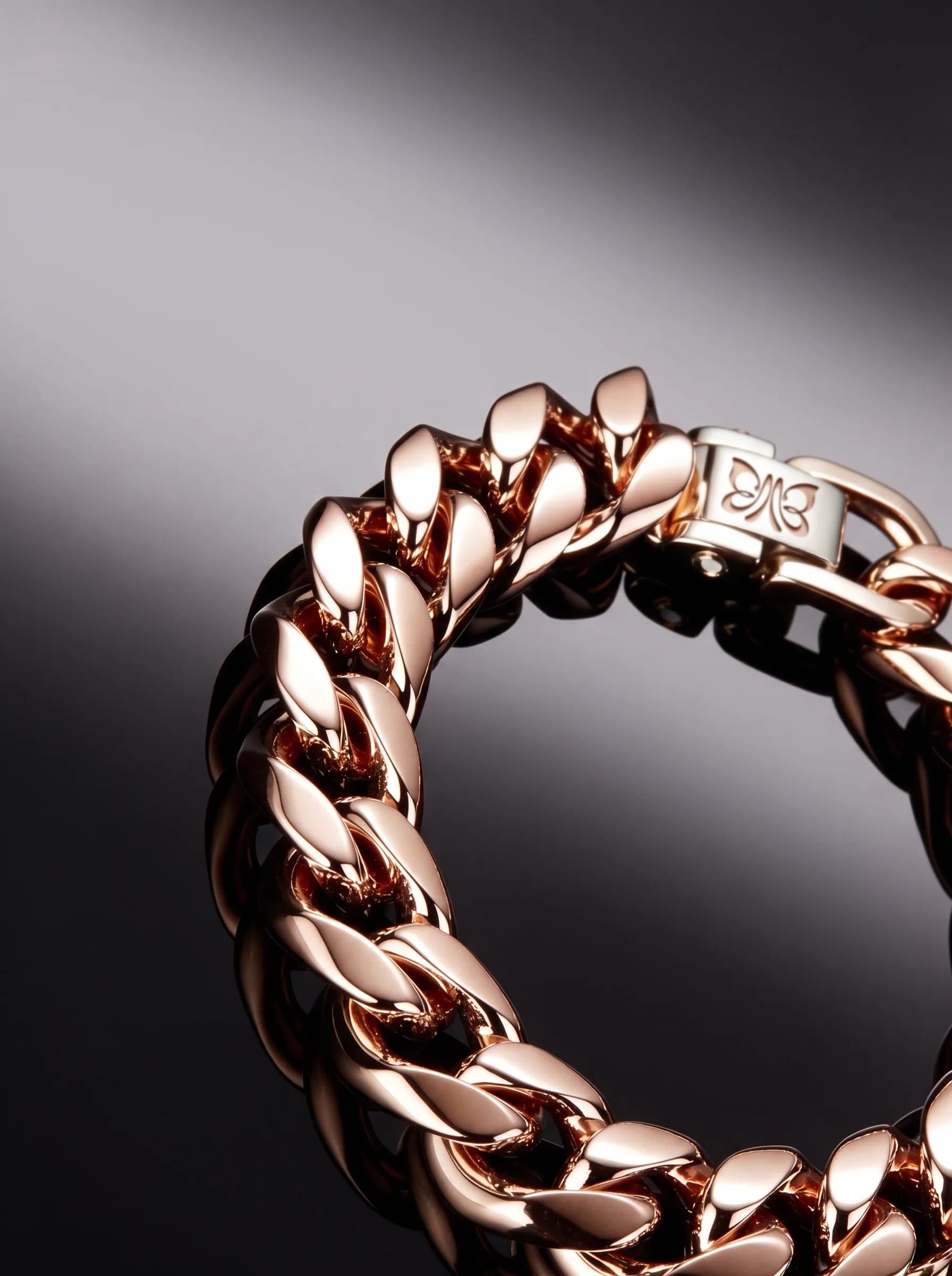
A detail-led product image system for the digital shelf: silhouette, clasp, link structure and the engraved mark, seen at the scale a product page needs.
Now
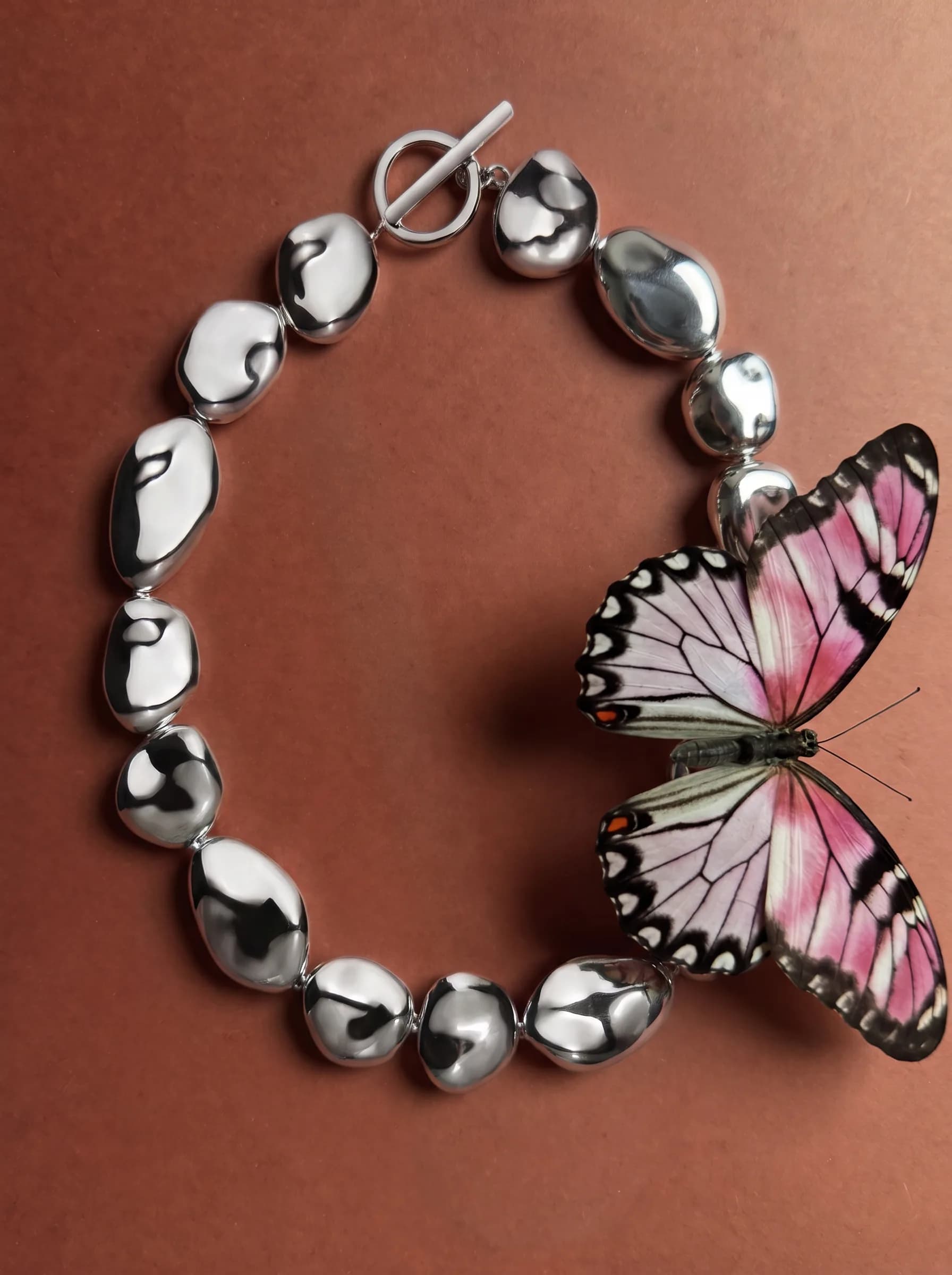
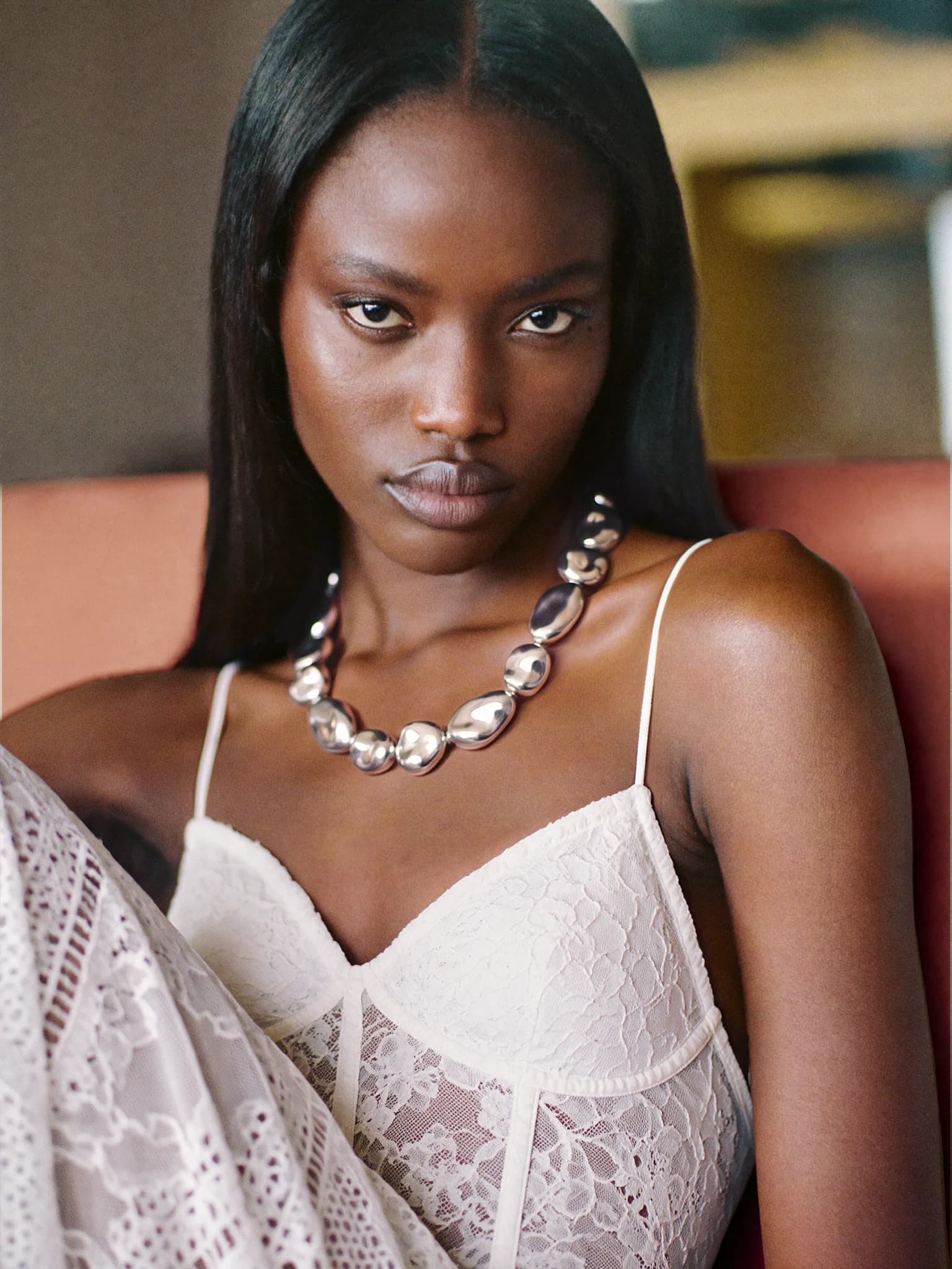
Sculptural, water-smoothed silver, styled against skin and lace - the most contemporary form the brand takes.
Further studies
Individual frames for editorial, social and product storytelling.